
Olive Oil Labels
Branding & Packaging Design for Venport
︎
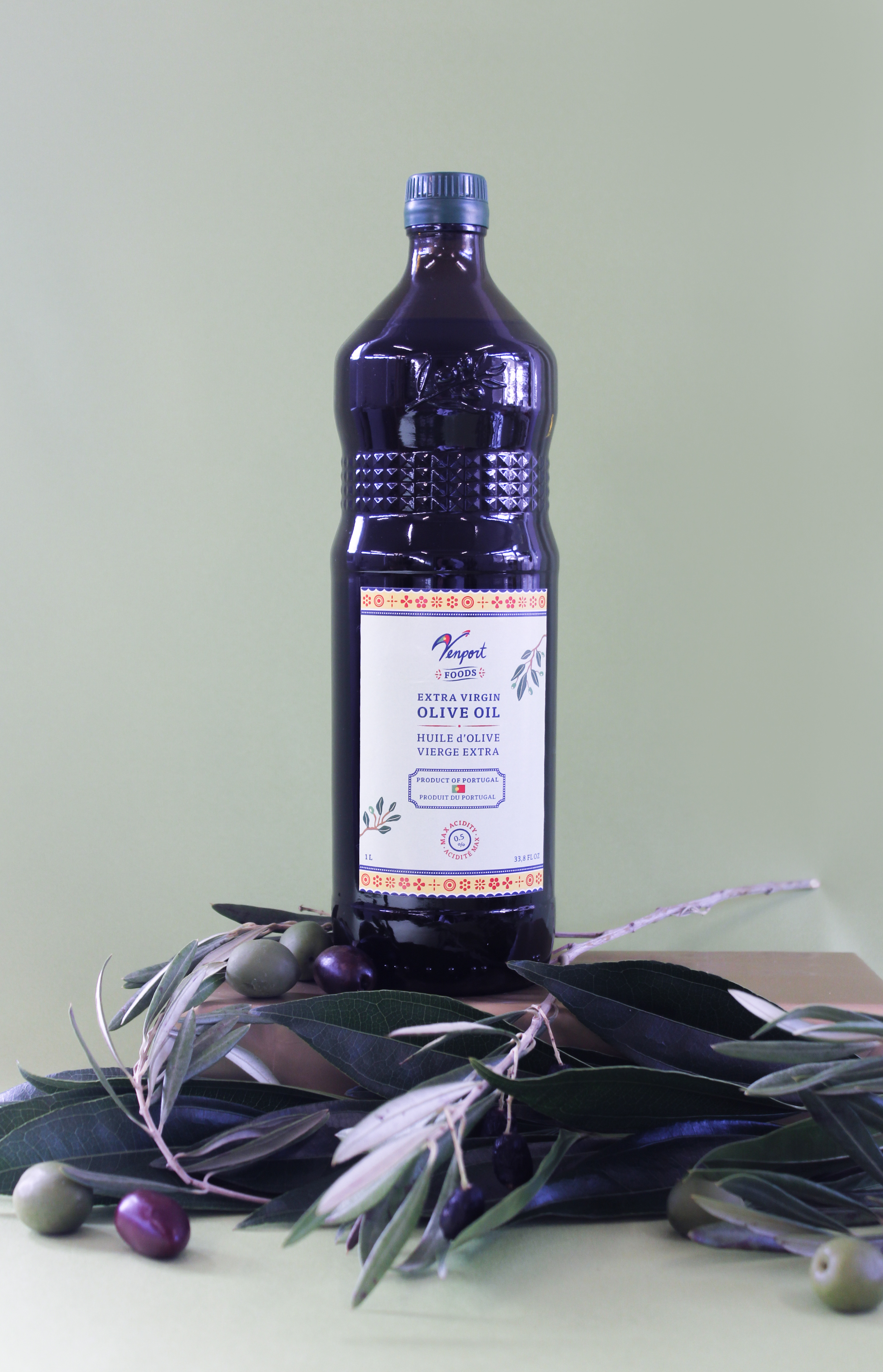
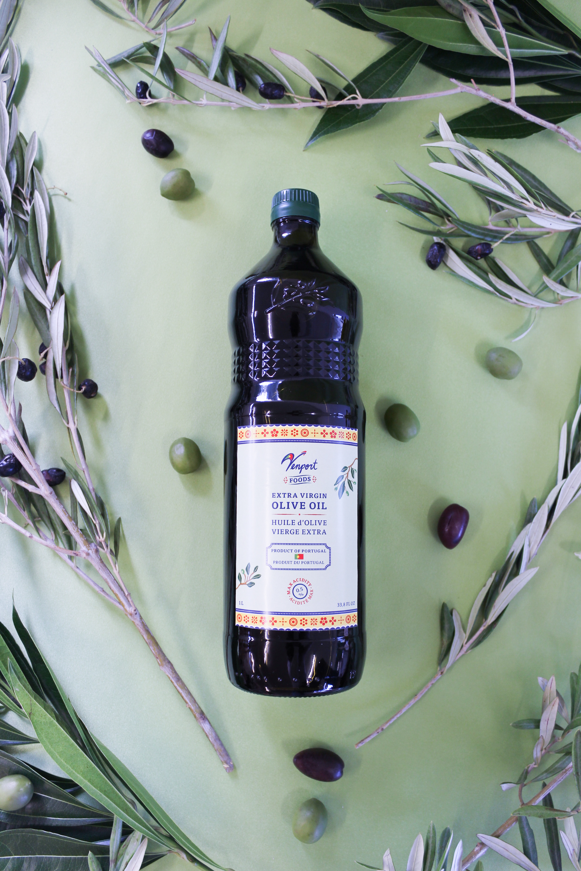
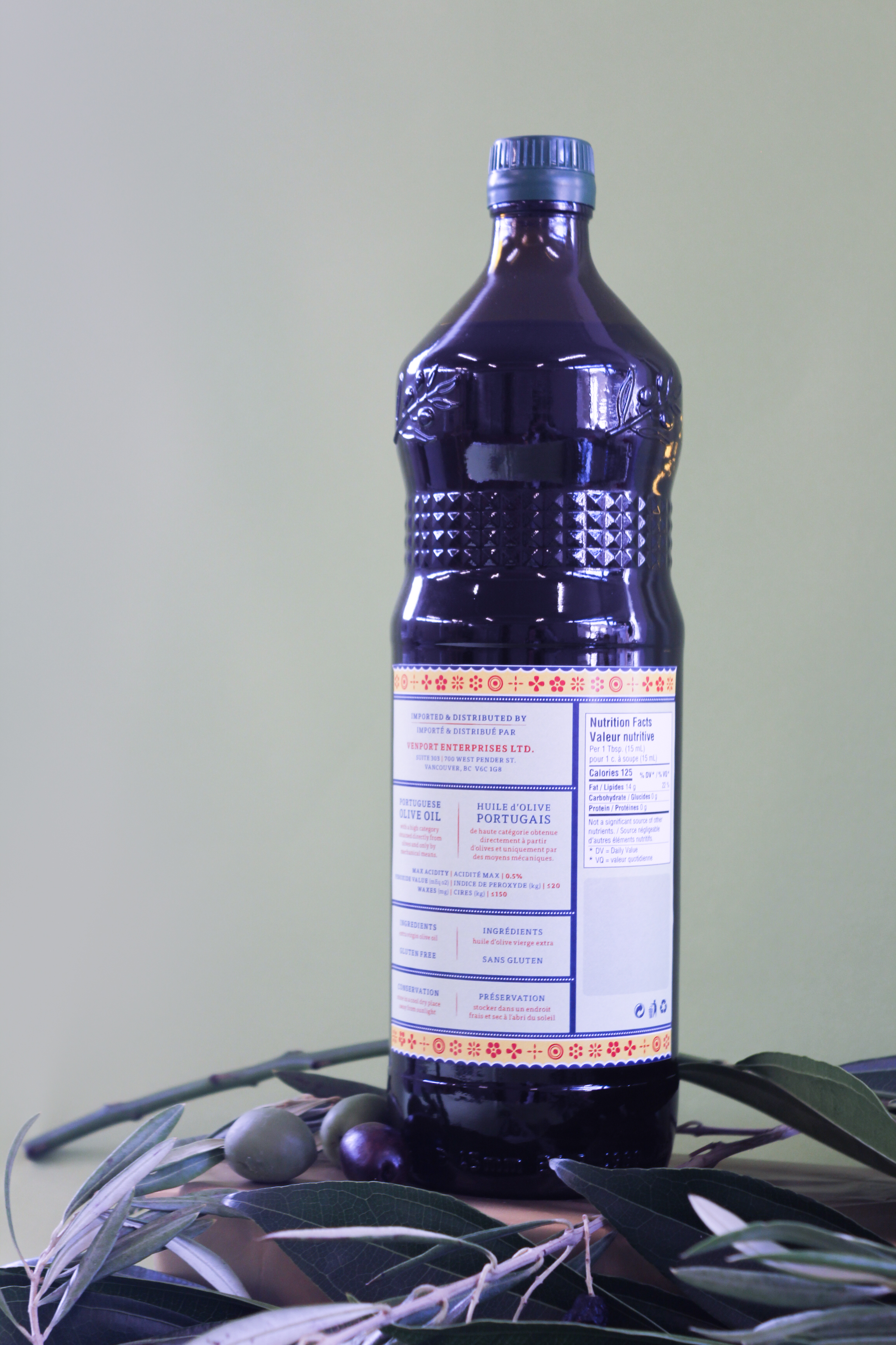
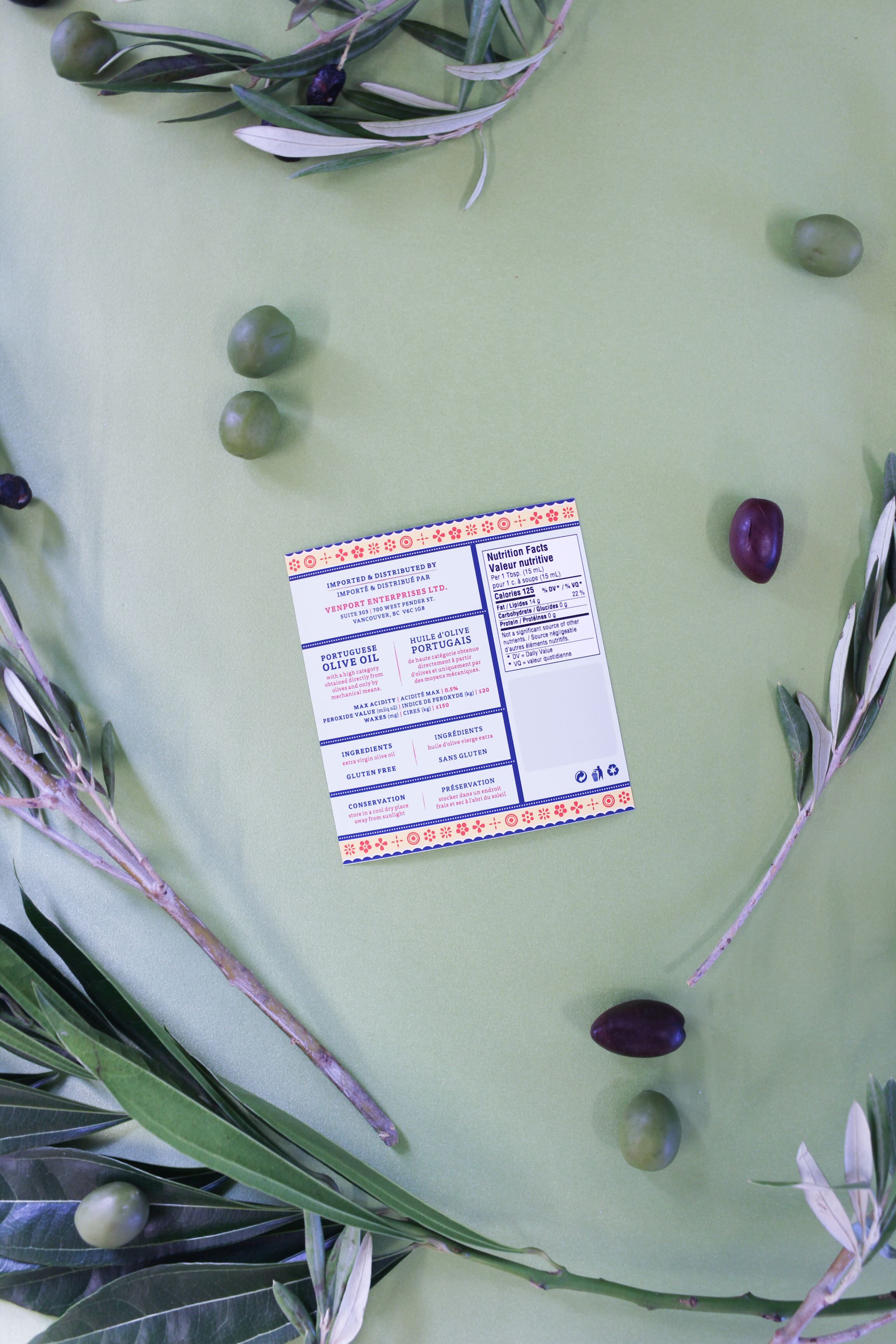
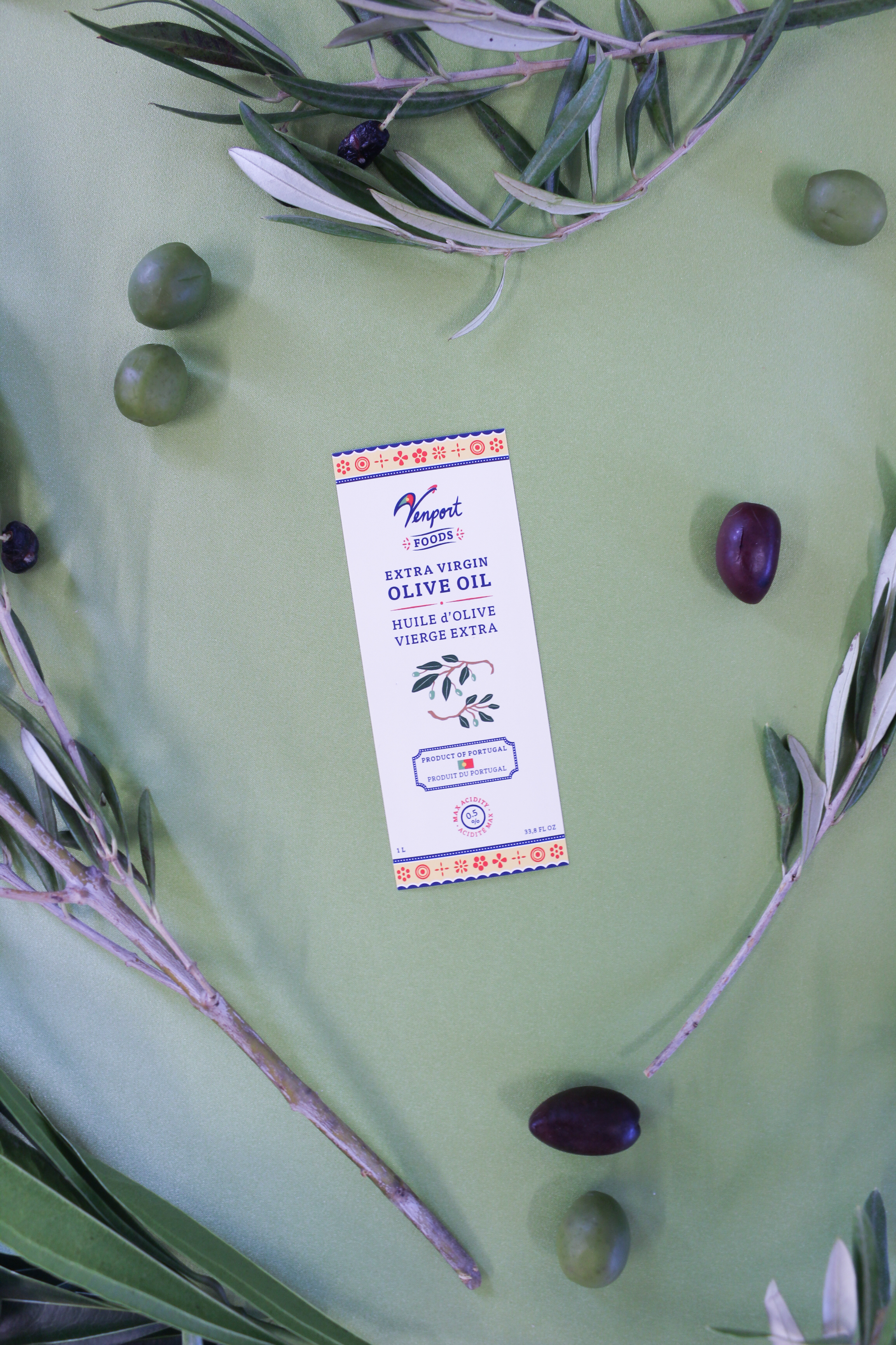
This project involved a new brand identity for the foods sector of Venport Enterprises. I also designed the front & back labels for these extra virgin olive oils that are imported from Portugal.
The idea and drawing of the “V” in “Venport” resembling a rooster was brought to me by my client’s creative consultant. I then completed the logo off by doing hand-lettering that flows with the letter “V”.
After some research into the rooster symbol, I found out that the Barcelos Rooster is the Portuguese’s symbol for their “love of life”, and it is often being painted and decorated simply and beautifully. The patterns on my labels are inspired by this.
Branding, Packaging Design, Creative Direction
Typefaces
— FF Tisa Pro: FontFontlabels: laser printed stickers on olive oil glass bottles


© 2025 · Christine Fwu