
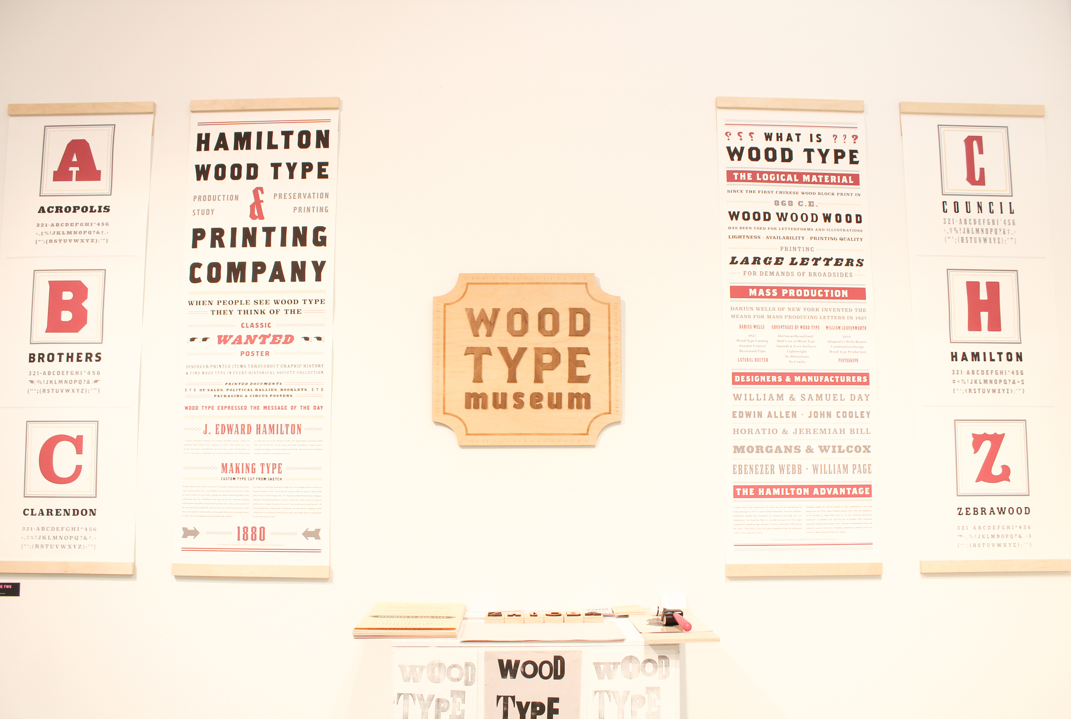
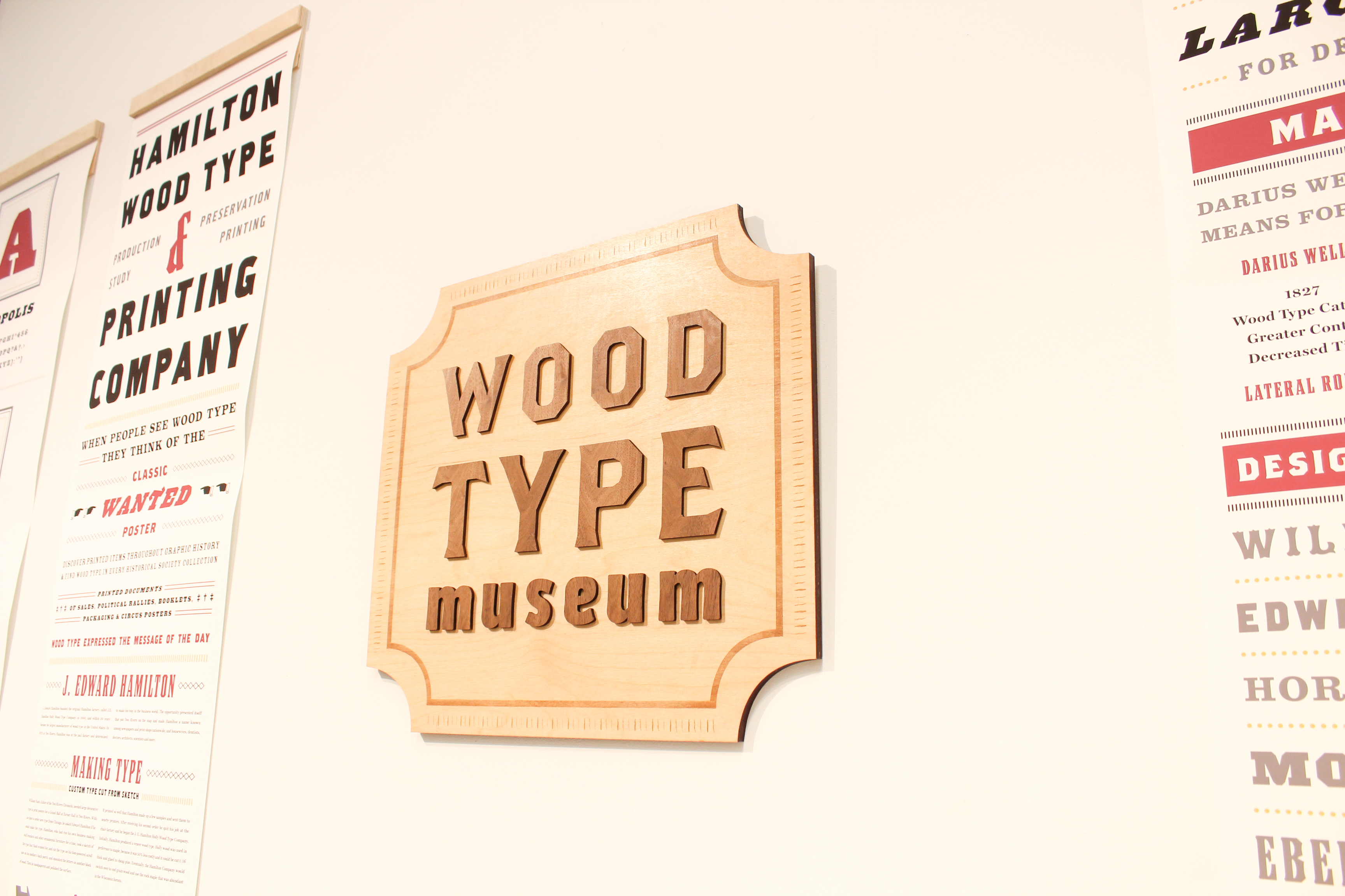
Wood Type Museum
The Pop-Up Type Museum
︎
The Wood Type Museum aims to tell a brief story of how wood type came to be through a series of long and narrow posters designed in the style of the 1800s.
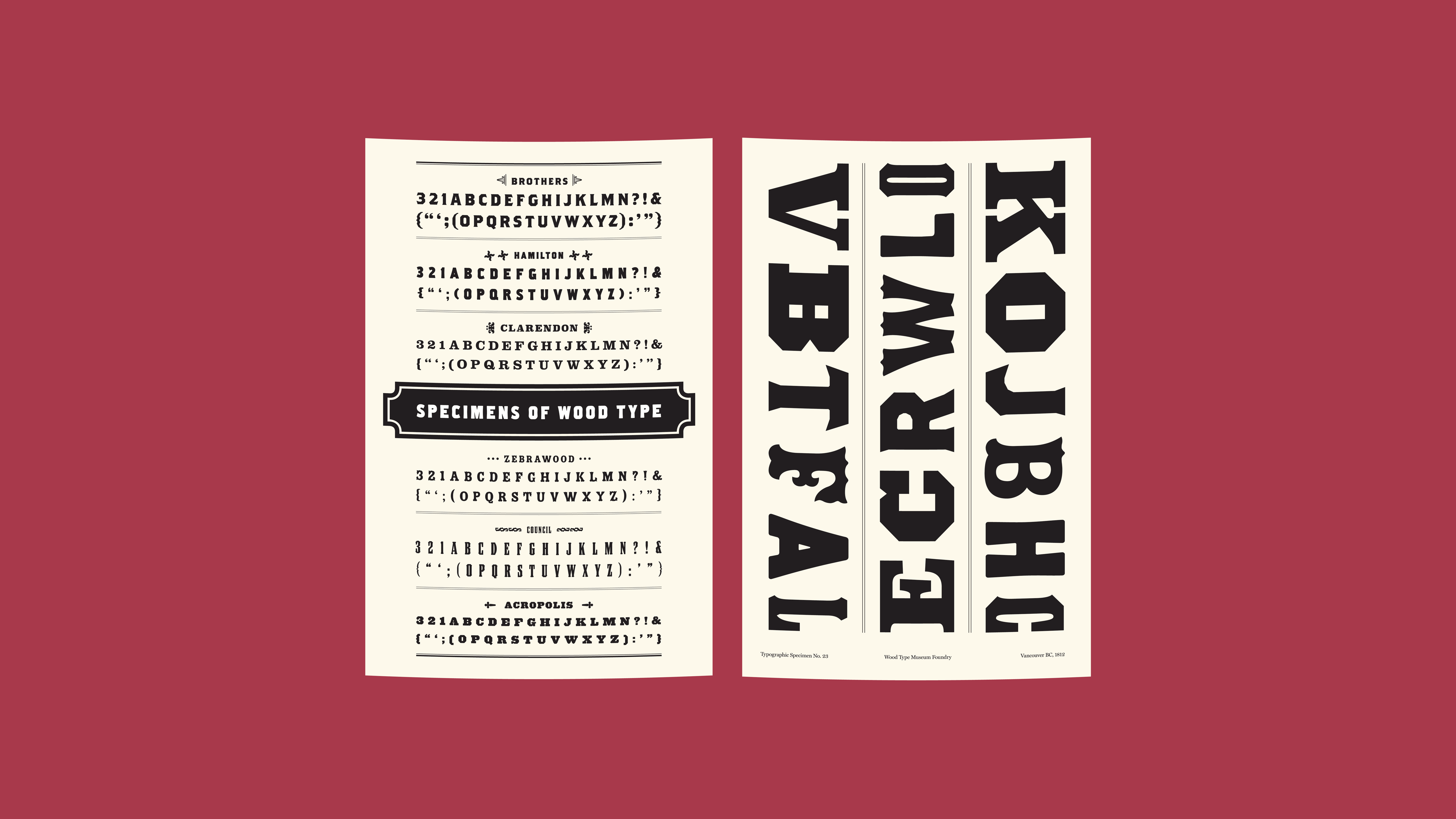
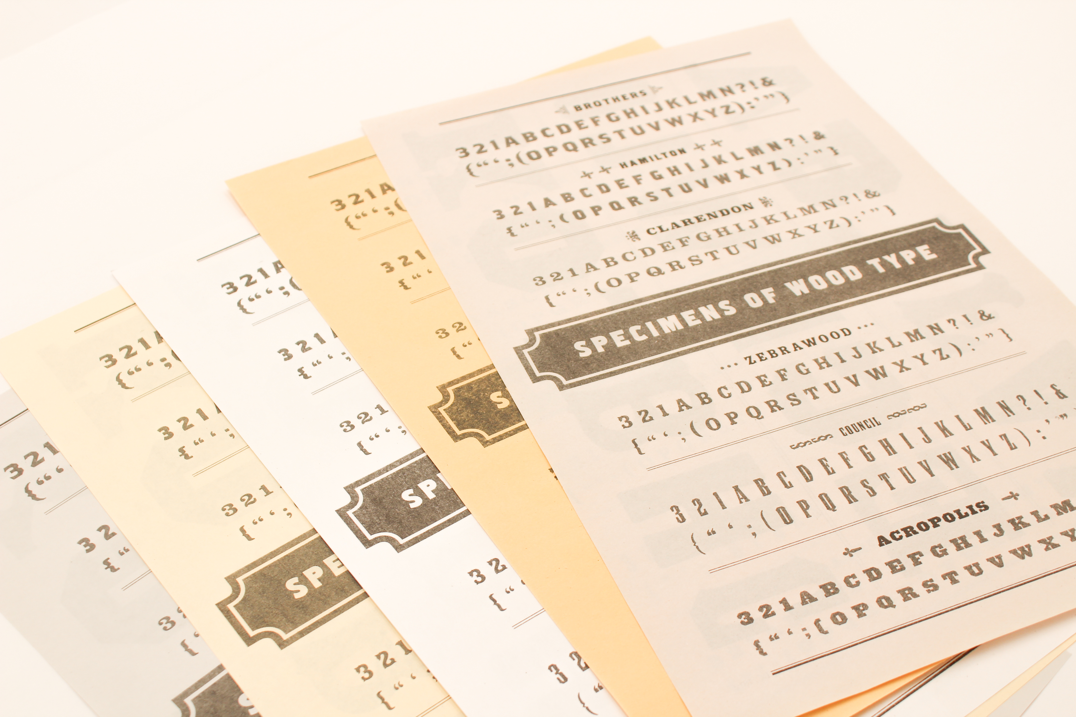
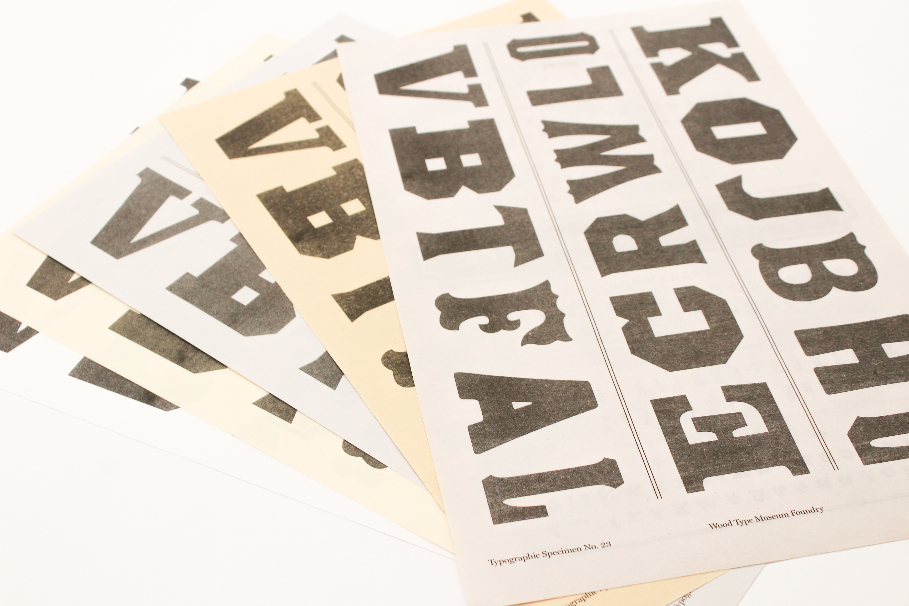
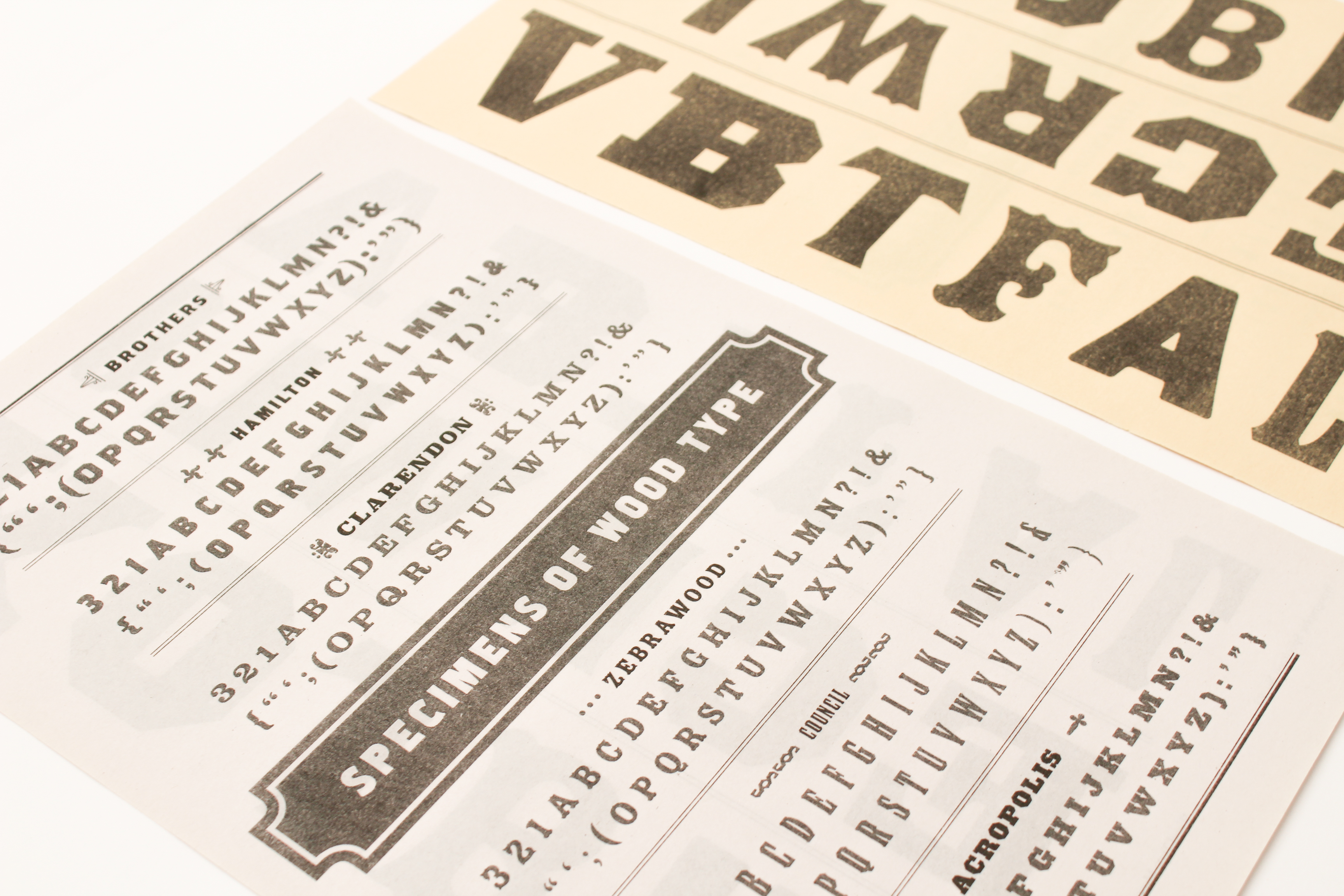
It showcases six different and intriguing wood typefaces that were all designed in around the 1990s and take on the look and feel of old wood typefaces.
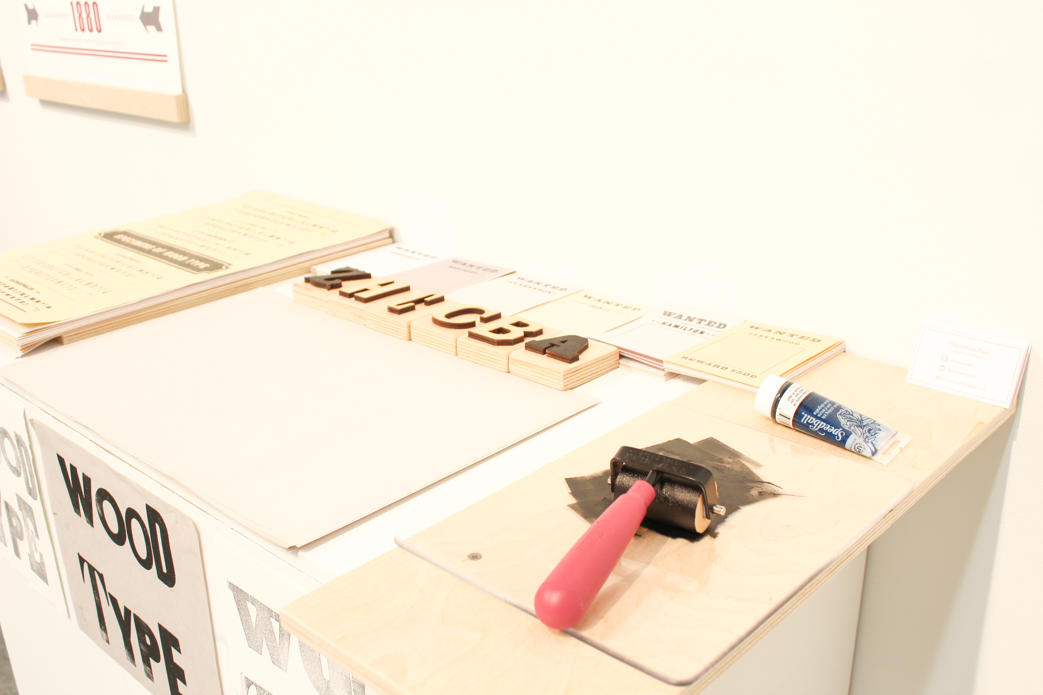
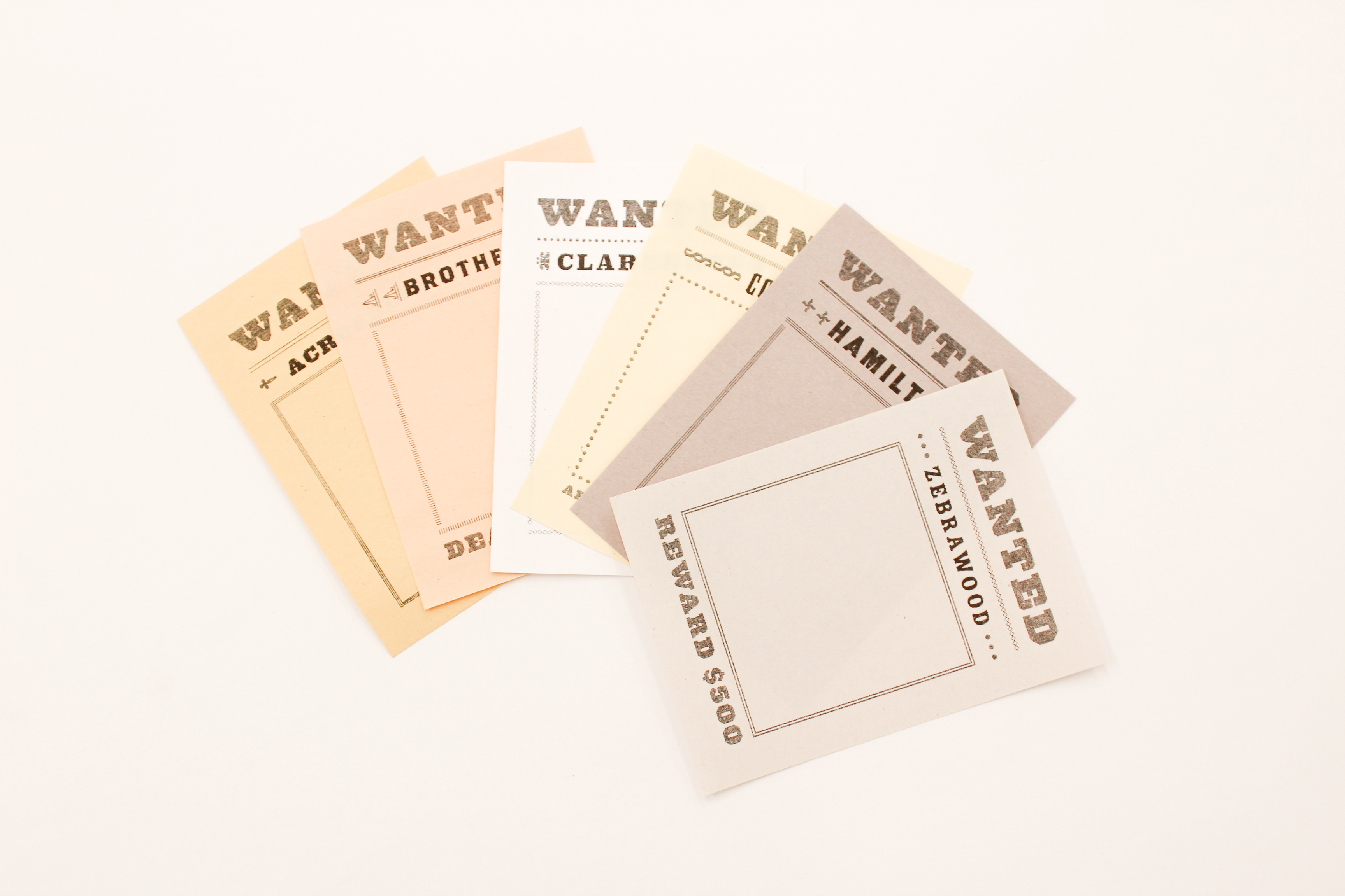
My exhibition invites the audience to interact with the type specimens that are free to take away. The physical wood block stamps that I have made encourage viewers to get hands on with the exhibition to create little WANTED posters as takeaways of their own! Using the context and concept of wood type, an experience is created for the viewer to venture back in time.
What to do at the WOOD TYPE MUSEUM:
Pick a WANTED poster card → Identify the typeface that it is “Wanting” → Find the right wood block → Roll ink on the block → stamp to WANTED poster card! → Use clothespin → Hang on wood stand to dry → Walk around & pick up later!
The Wood Type Museum exhibition was a part of the annual event, Type Brigade No. 48 × The Pop-Up Type Museum, held at Emily Carr University of Art + Design.
View the presentation here.
Typography, Exhibition Design, Print, Workshop
Typefaces
— Acropolis: Hoefler & Co. (1992)— Zebrawood: Adobe Originals (1994)
— Hamilton: Font Bureau (1993)
— Clarendon: Fann Street Foundry (1845)
— Brothers: Emigre (1999)
— Council: Emigre: John Downer (1999)
long posters: inkjet prints on enhanced
matte with birch wood pieces
sign: laser cut/engraved birch & walnut
wood block stamps: laser cut birch
wood stand/hanger: birch, twine, clothespins
specimens & WANTED poster: risoprinted with black
letterpress prints: “WOOD TYPE” printed in assorted
wood typefaces


© 2025 · Christine Fwu